ATRIUM 08
Cool colours for summer


“I discovered various papers from University College London and the University of Southampton that establish a psychological link between thermal comfort and colour perception. Supporting my own findings, they suggest that a room painted in reddish colours can feel warmer than one painted blue or green.”
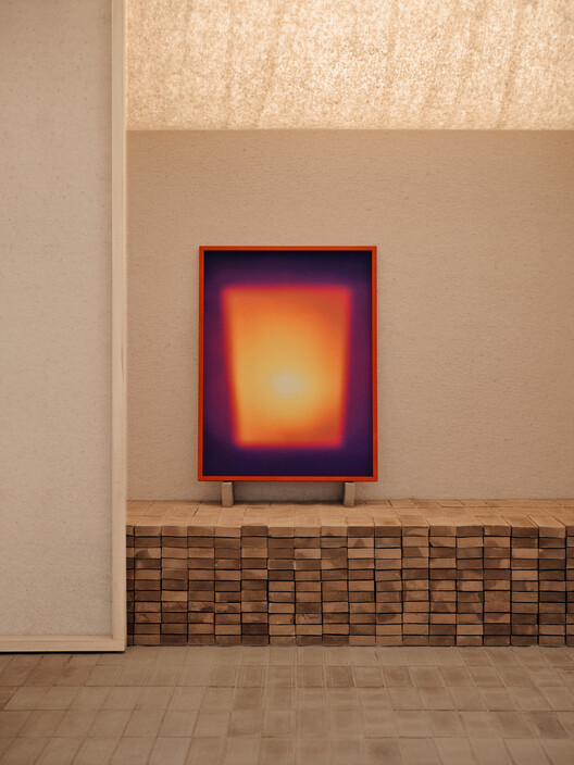
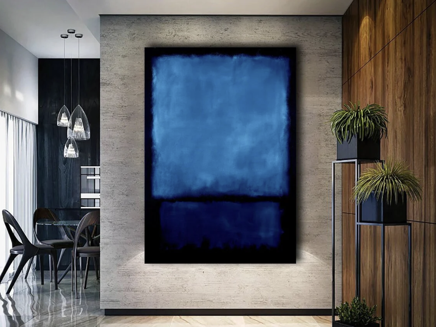
“This reminded me of the Slovenian Pavilion at the 2023 Architecture Biennale, which the Mulroy team visited to celebrate our 15th birthday. The theme of the room was to draw attention to traditional building as a way to address climate change. It featured a Rothko-like painting in place of a log fire (left, below). The effect was amazing: it felt as though heat were radiating from the canvas. In contrast, the picture below right shows Rothko’s ‘Blue and Black’ (1951) in a room with similar finishes..”
“How this translates to buildings is interesting. In No Ordinary House, the colder north-facing rooms were painted darker, richer colours and the southerly rooms lighter shades albeit in cooler shades of green. I do not advocate repainting your home to match the seasons, but perhaps you might consider a set of summer artwork for your walls in cooler shades, such as the Rothko, and winter artwork containing oranges and reds, such as one of Joseph Albers’ ‘Homage to the Square/Red Series’ paintings from 1968, that is similar to the painting in the Slovenian Pavilion.”
“The other thing to think about is the room acoustics. Hard surfaces that make the room echo slightly will create an acoustic that feels cooler, whereas the muffled sounds caused by cushions, curtains and carpets will make the room feel warmer. With the increased temperature range between summer and winter, I think we will see the emergence of seasonality in room dressing.”
Andrew Mulroy
Mulroy Architects, May 2026